Search
Styles
Serif fonts
Sans serif fonts
Fixed width fonts
Gothic fonts
English fonts
Cyrillic fonts
Crazy fonts
Handwriting and Calligraphy fonts
Brush fonts
Types
Regular fonts
Bold fonts
Normal fonts
Italic fonts
Bold Italic fonts
Roman fonts
Medium fonts
Oblique fonts
Plain fonts
Light fonts
Condensed fonts
Expanded fonts
Book fonts
Outline fonts
Shadow fonts
Capitals fonts
Demi fonts
Fog fonts
Thin fonts
Laser fonts
3D fonts
Century Gothic Univers Condensed ArialMT Futura Mistral Verdana Century Gothic Gotham Shelley Allegro Script Serpentine
Our friends
MyFonts Free logos download Free Fonts DownloadFree FontsLanguages
English
Deutsch
Français
Español
Português
Italiano
Русский
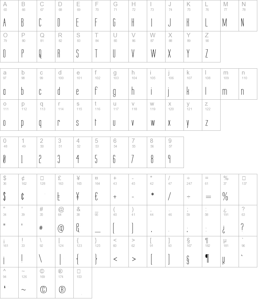
Labtop Secundo Regular truetype font
This is the page of Labtop Secundo font. You can download it for free and without registration here. This entry was published on Sunday, September 04th 2011, at 12:16 AM and was placed in the Regular catalog. Version of the Labtop Secundo is 1.0. This page was viewed 372 times. File was downloaded 1033 times.
- Name: Labtop Secundo
- Version: 1.0
- Type: Regular
- Category: L
- Added: 2011-09-04
- Viewed: 372
- Downloaded: 1033
Copyright (c) Graham Meade & Apostrophic Labs, 2001. All rights reserved. Email info@apostrophiclab.com or visit www.apostrophiclab.com for more information.
Similar fonts:
Comments:
2013-06-30 02:29 pm
was important). But the diisucsson is very important, and in the course of that I'm going to articulate my point of view as well, that's the nature of a debate. I don't want it to sound like I'm mad or upset or pissy or anything, because I'm not I enjoy the intellectual diisucsson.In general, the overarching design consideration, both from a coding and a drawing perspective, has been the tension between making it possible to use this thing just like HM2.x for the casual user point, click, it appears, move on and letting the advanced user do some really amazing things if they want to spend a lot more time with it. Sometimes those things conflict. For instance, ideally all items would appear on their own center-point, so when you rotate them, they spin on their center. But if I did that, then when you clicked an item initially it wouldn't appear in-place on the figure, you'd have to manually move each one to where you want it to be.The former option is better for your Power User, the latter (much) better for your Casual User. I can't do both, so I had to choose.I'm running into that constantly, like with item design. Do I do EVERYTHING as broken apart pieces so you can assemble it yourself, or do I do everything as complete items? So far I've basically been doing both, but that too comes at a cost of much larger numbers of items to wade through to find the one you want, longer load times, etc.That got kind of rambling. Sorry!
Add comment


