Search
Styles
Serif fonts
Sans serif fonts
Fixed width fonts
Gothic fonts
English fonts
Cyrillic fonts
Crazy fonts
Handwriting and Calligraphy fonts
Brush fonts
Types
Regular fonts
Bold fonts
Normal fonts
Italic fonts
Bold Italic fonts
Roman fonts
Medium fonts
Oblique fonts
Plain fonts
Light fonts
Condensed fonts
Expanded fonts
Book fonts
Outline fonts
Shadow fonts
Capitals fonts
Demi fonts
Fog fonts
Thin fonts
Laser fonts
3D fonts
Century Gothic Univers Condensed ArialMT Futura Mistral Verdana Century Gothic Gotham Shelley Allegro Script Serpentine
Our friends
MyFonts Free logos download Free Fonts DownloadFree FontsLanguages
English
Deutsch
Français
Español
Português
Italiano
Русский
LTProjekt Heavy Regular truetype font
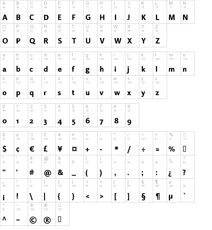
This is the page of LTProjekt Heavy font. You can download it for free and without registration here. This entry was published on Thursday, September 15th 2011, at 09:14 PM and was placed in the Regular catalog. Version of the LTProjekt Heavy is Version 1.0; 2000; initial release. This page was viewed 487 times. File was downloaded 1224 times.

- Name: LTProjekt Heavy
- Version: Version 1.0; 2000; initial release
- Type: Regular
- Category: L
- Added: 2011-09-15
- Viewed: 487
- Downloaded: 1224
Linotype Projekt Heavy is a Trademark of Heidelberger Druckmaschinen AG, which may be registered in certain jurisdictions, exclusively licensed through Linotype Library GmbH, a wholly owned subsidiary of Heidelberger Druckmaschinen AG.
Similar fonts:


Comments:
2013-06-29 11:36 pm
Marmelad is a true sans-serif. There are slab types, which I love. They're simpler than serif types, but the ultra-simple sefirs make them feel like sans.I'm a sucker for display type, the fancy schmancy stuff you can only use for big headings and show-off stuff.
Add comment